


Nobody remembers a brand that looks like everyone else’s.
If you’ve ever sat down to build a brand and felt the pull toward soft pastels, plant emojis, and the word “empowered” slapped on everything… you’re not alone.
It’s the default. It’s also forgettable! 😂
Here’s what I keep coming back to with clients who want a brand that actually sounds and looks like them.

Start with the person, not the palette
Every brand session I run starts the same way. Not with colours. Not with fonts. With who this person actually is.
One of the most useful exercises for this: describe your brand’s personality in five words or fewer.
Clever, magnetic, direct, curious, unexpected.
Five words, and suddenly every design decision has a filter to run through.
If a font or colour doesn’t match those five words, it’s not your brand, no matter how nice it looks on its own.
Know your one thing that nobody else has
Every brand has competitors. What it doesn’t always have is a clear answer to “why me and not them?”
A strong USP usually comes from combining two things that don’t normally go together.
For example, a background in nutrition science paired with stand-up comedy.
Or a corporate finance career combined with a passion for tarot and intuitive coaching.
The magic is rarely in doing one thing better. It’s in the combination nobody else has bothered to put together!
Pick colours that mean something, not colours that are safe
Hot pink.
Lime green.
Bold orange accents.
That’s not a palette I’d normally reach for on instinct, but it’s exactly right for a brand built on confidence and energy.
The lesson here: don’t default to what’s trendy or “safe.”
A palette should communicate a feeling before anyone reads a single word. In this mock example, the colours feel warm, intelligent, expressive, and slightly unexpected.
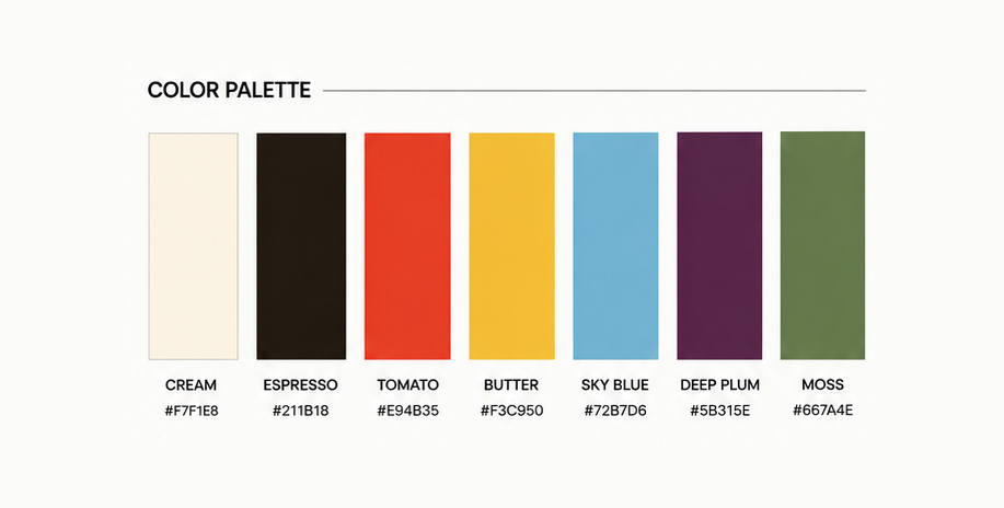
Ask what colours actually reflect the energy you want people to feel.
If your brand is loud, playful, and unapologetic, muted pastels will always feel like a mismatch, no matter how nicely they’re arranged.
Get specific with the weird exercises
If your brand were a person, how would they sound? Humorous and overly confident.
If your brand were a scent, what would it smell like? Electric cherry, sweet with a bit of edge.
These questions feel a little silly to answer, but they’re some of the fastest ways to unlock a brand voice that feels true instead of templated.
A scent and a sound tell you more about tone than a mood board ever will!
Try it yourself: Grab a notebook and answer these three in under five minutes.
- What five words describe your brand?
- What scent would it be?
- What’s the one thing about you that nobody else in your space has?
Once the personality is clear, it becomes easier to build a visual language from shapes, patterns and details that reinforce it.

Know what to avoid just as clearly as what to include
Sometimes the clearest brand direction comes from naming what you’re not. No plant imagery. No soft self-love clichés. No generic “girl boss” visual language.
This works for competitor research too. Looking at sites you like and don’t like, and naming specifics (too dull, hard to navigate, lacking personal photos, too wordy) gives a designer far more to work with than “make it pop.”

Inspiration should describe an energy, not become a collection of things to copy. Bright ideas, offbeat energy and modern nostalgia each give the direction a clearer creative filter.
Let your audience shape everything
A brand isn’t just for the person behind it. It’s for the specific humans it’s trying to reach. Not “everyone.” Not “women.” A tight audience description, down to age range, interests, and values, changes everything from tone of voice to photo style to which platforms actually matter.
If your audience segments differently depending on what they’re there for (readers versus brand partners versus event bookers, for example), it’s worth naming each one separately.
They don’t all need the same message on your website!
Accessibility is a design choice, not an afterthought
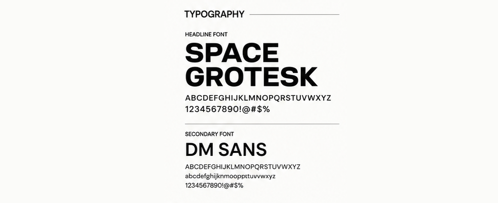
Readable fonts, strong contrast, and image captions that do double duty, both functional and creative, are so important! Bold sans-serif fonts can absolutely still feel accessible while also feeling modern and edgy; it’s not an either/or.
Accessible design doesn’t have to feel clinical. It can still be weird, colourful, and full of personality. It just means more people get to actually experience it!
Bold typography can still be clear, legible, and inclusive. Personality and accessibility do not have to compete with one another.
Let subtlety do some of the work
Not every part of someone’s identity needs to be spelled out in bold iconography.
Sometimes the most respectful, most authentic way to represent something is through the details, a photo that includes a mobility aid without making it “the point,” for example.
Representation doesn’t always need a megaphone. Sometimes it just needs to be present!
Build the hub before you build everything else
If someone has a book, a newsletter, a podcast, and a following scattered across platforms, the first job isn’t more content. It’s a single home base that ties it all together. One hub with one clear next step for every visitor, whether that’s buying a book, booking a brand collaboration, or subscribing to a newsletter.
Once you’ve nailed the personality and voice work above, the next step is turning it into a full visual system, logo suite, guidelines, and all the assets that keep you consistent everywhere. If you want the deeper dive on that, I broke it down in Beyond the Logo: A Brand Identity Strategy Guide for Ambitious Leaders.
It should feel like you, not just look like you
The real test of a brand isn’t whether it looks polished. It’s whether the person sees it and feels seen.
After walking through this same kind of exploration with a recent client, kicking off her brand strategy and getting into the exploration phase, she put it simply:
“I feel like everything we got here is on point, perfect. It really feels like me!”
And by the end of the session:
“I feel like this is going to be a huge step forward for my business.”
That’s the freaking goal every time!
Not just a brand that looks good on a screen, but one that feels like a mirror. When someone can look at their own colours, fonts, and voice and think, “Yes, that’s me!” the rest of the business decisions get easier. The website, the content, the pitch, it all just clicks into place because it’s finally speaking in their real voice.
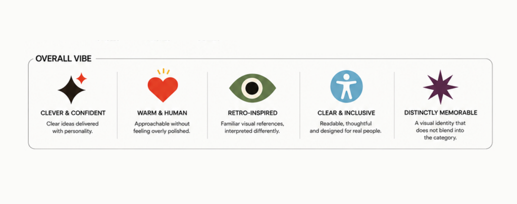
The final direction should be easy to describe in human terms. Clever, warm, inclusive and memorable says more about how the brand should feel than a list of trends ever could.
Move in phases
First and foremost, branding first! Website after.
Trying to do it all at once is how projects stall. Nail the identity, get the colour palette and logo direction locked in, then let the digital presence build on a foundation that’s already solid.
Final takeaway
A bold, authentic brand doesn’t come from finding the trendiest aesthetic. It comes from getting specific: five words, one scent, one clear audience, one thing nobody else offers, then building every visual and messaging pillar on top of that foundation.
Ready to find your five words? Book a Discovery Call and let’s get your brand out of your head and onto the page!


We don’t just get to know you.
We dive deep into your brand identity and website design goals.
Your personalized brand identity, website design, and digital marketing studio serving Canadian and US businesses.
Explore more ways to evolve!
Brand Strategy & Business Development
strategy SERVICES
Uncover Your Strategy
Brand Identity & Logo Design
BRAND IDENTITY SERVICES
01
02
Website Design & Content Development
WEBSITE DESIGN SERVICES
03
Shape Your Identity
Launch Your Site


Digital
Marketing
DIGITAL MARKETING SERVICES
04
Boost Your Reach

Website Design + Content Development
Logo & Brand Identity
Brand Strategy & Business Development
Digital Marketing

Contact

Branding, Web Design & Digital Marketing agency
Contact
Our Values
What To Expect
Meet Ash & The Team
FAQS
Reviews ★★★★★
